 Throughout the design of our album cover and website, we made sure to relate the themes and visual motifs from our music video, creating a brand image. During our planning stage of the music video, we created a pitch of our ideas to present to an audience to get feedback. Here is a mood board of some of the ideas we discussed, and as you can see there is a recurring theme of symbolism, paganism, enigma and an underground feel to both our music and image.
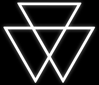
 We developed a logo that was then used in our music video as the background to our performance and in the UV on our lead singer's chest, on the website multiple times and the front of the album cover. The consistent use of the logo provides a visual motif recognised as a representation of our band.

Half way through post-production, we decided to collaborate with 'Influx', another group's artist creation of a similar genre. We produced this poster.
Promoting both our bands simultaneously, we felt that this symbiotic relationship was mutually beneficial and was a great example of a marketing plan used in the real music industry to further an artist's career and build an artist identity.
 We developed a colour scheme of acid blue, white and black that ran consistently through our website and album cover. We also managed to incorporate it into our video during colour grading of the narrative where we added a blue tint to highlight the supernatural elements of the video but more relevantly to provide a consistency throughout our marketing and image development.
 Our website is the heart of our entire project. We have both our album cover spread and music video on it, enabling our fans to access everything they need in one easy to use, efficient place.


No comments:
Post a Comment