Thank you for taking the time to read my individual and group blogs. You will find my finished video, album cover and website at the top of the blog, as well as on our group blog.
My sidebar offers links to relevant blogs and a label list.
I hope you enjoy my blog,
Eva Calland-Waller 3116


Friday 16 December 2011
This Blog is Closed!
After a long yet extremely enjoyable and satisfying project we are finished!
I have enjoyed every moment, maybe excluding the running, and come away from this with 2 firm friends and a lot more experience.
Eva Calland-Waller
I have enjoyed every moment, maybe excluding the running, and come away from this with 2 firm friends and a lot more experience.
Eva Calland-Waller
Thursday 15 December 2011
Question 4: How did you use new media technologies in the construction, research and planning and evaluation stages?
Equipment - Canon 550D

Obviously, without a camera a music video is impossible. Luckily for us, Eoin had a Canon 550D and was able to borrow another one so we were able to use high quality cameras to film all our footage. An added benefit of the canons was that all our footage was saved onto memory cards so unlike last year, we were able to copy and paste large amounts of files without capturing. This meant that the time taken importing our footage was reduced massively, which we needed as we filmed over 150G worth of footage!
Lights - Strobe; 650 Watt Redhead lights; Neon Bulbs
 Artificial lighting was only necessary for our performance. Natural, outdoor lighting proved to be excellent for the narrative filming, especially under the lens' of the canons.
For the performance, however, we had to use a set of 3 650 watt Readhead lights and one work light. In total we had 3 performance shoots, and although our first shoot was over-exposed, it proved to be a learning curve and the second and during the second and third shoots the equipment proved invaluable.
For the second section of our performance, we decided to use neon paint which meant that the lighting needed to change. We used 2 neon bulbs, one above the performance and another at the side. Without those bulbs the neon element would not have been possible and there would have been no progression to our performance.
 Web 2.0 - Youtube; Twitter; Facebook; Blogger; Google Maps; Wix
To advertise our product and to build a band identity, we utilised web 2.0, focusing on social networking sites as a huge percentage of our target audience of 15-25 year old males are frequent users of them.
We created a Facebook page and a Twitter account, enabling fans to follow/subscribe to our updates, finding out information about upcoming gigs etc. We found it was a great promotional tool, for the creation of our product, but also the advertisement of our screening of all the music videos produced in our media class. We were able to create an event on facebook and invite our entire year. Over 100 people turned up, showing the power of social networking.
We also used Youtube to upload the first edit of our music video, which meant that getting audience feedback was simple as the video was easy to access from any computer. Youtube was also where we uploaded our final music video:
OUR VIDEO ON YOUTUBE
My other main use of web 2.0 has been Blogger. As you can see this blog has made it incredibly easy to present ideas, thoughts, updates, photos and videos. It has been indispensable and saved a lot of time. Managing the blog and the presentation of the entire project has been simple, and last year's use of it meant that I had experience with it already so was able to use it much more fluidly and confidently.
 During location scouting, I used Google Maps to quickly find alleyways via the birds eye view then see whether the location and appearance was suitable for the video. Again, this saved us a lot of time and energy as our only other option would have been to physically go out looking which would have wasted time better spent on set dressing etc.
Our website was created on Wix, a Flash website-building site. We were able to create a professional and dynamic website, catering to all our needs, in a reasonably short amount of time. However, we did come across some issues; see here for a post on Wix-gone-wrong.
Our group have used a number of Adobe CS5 softwares throughout the project.


Obviously, without a camera a music video is impossible. Luckily for us, Eoin had a Canon 550D and was able to borrow another one so we were able to use high quality cameras to film all our footage. An added benefit of the canons was that all our footage was saved onto memory cards so unlike last year, we were able to copy and paste large amounts of files without capturing. This meant that the time taken importing our footage was reduced massively, which we needed as we filmed over 150G worth of footage!
Lights - Strobe; 650 Watt Redhead lights; Neon Bulbs
For the performance, however, we had to use a set of 3 650 watt Readhead lights and one work light. In total we had 3 performance shoots, and although our first shoot was over-exposed, it proved to be a learning curve and the second and during the second and third shoots the equipment proved invaluable.
For the second section of our performance, we decided to use neon paint which meant that the lighting needed to change. We used 2 neon bulbs, one above the performance and another at the side. Without those bulbs the neon element would not have been possible and there would have been no progression to our performance.
To advertise our product and to build a band identity, we utilised web 2.0, focusing on social networking sites as a huge percentage of our target audience of 15-25 year old males are frequent users of them.
We created a Facebook page and a Twitter account, enabling fans to follow/subscribe to our updates, finding out information about upcoming gigs etc. We found it was a great promotional tool, for the creation of our product, but also the advertisement of our screening of all the music videos produced in our media class. We were able to create an event on facebook and invite our entire year. Over 100 people turned up, showing the power of social networking.
We also used Youtube to upload the first edit of our music video, which meant that getting audience feedback was simple as the video was easy to access from any computer. Youtube was also where we uploaded our final music video:
OUR VIDEO ON YOUTUBE
My other main use of web 2.0 has been Blogger. As you can see this blog has made it incredibly easy to present ideas, thoughts, updates, photos and videos. It has been indispensable and saved a lot of time. Managing the blog and the presentation of the entire project has been simple, and last year's use of it meant that I had experience with it already so was able to use it much more fluidly and confidently.
 During location scouting, I used Google Maps to quickly find alleyways via the birds eye view then see whether the location and appearance was suitable for the video. Again, this saved us a lot of time and energy as our only other option would have been to physically go out looking which would have wasted time better spent on set dressing etc.
 Our website was created on Wix, a Flash website-building site. We were able to create a professional and dynamic website, catering to all our needs, in a reasonably short amount of time. However, we did come across some issues; see here for a post on Wix-gone-wrong.
Editing Software - Adobe CS5: Photoshop, Premiere Pro; Colour
Our group have used a number of Adobe CS5 softwares throughout the project.
Photoshop
We used Photoshop to edit all of our pictures for the website and album cover as well as the logo.
A large amount of photos were needed for the website, and once I got used to using the software and learnt the shortcuts and tools I found that I was able to effectively transform a large amount of photos to look professional and to adhere to our intended image in a short amount of time.

As you can see here, the album cover photographs were completely re-worked on Photoshop to suit our intended appearance. We were able to colour-correct the photos as the lighting was different in each picture to create a sleek and consistent image.
Premiere Pro
Premiere Pro was the primary editing software for our video. We were able to initially cut down the original track by Pendulum to suit the brief and then add the visuals using the track and tools to edit the footage. We also used this software to start our colour-correction, but then moved onto a more advanced colour-correction software; Colour.
Question 3: What have you learnt from your audience feedback?
After we completed our first edit, we were eager to get it up and get some initial feedback from people.
The main issues raised were:
As well as getting individuals to watch our video, we also had a department screening of all the videos, which meant that a multitude of people watched our video from both our primary audience and secondary, etc. We advertised this via posters, Facebook posts and a Facebook page, and a promo video:
After the screening we filmed this feedback:
The responses were pretty much what we expected, and we found that our primary audience generally enjoyed the video most. Special mention was made to the close-ups of Eoin and the UV, and the narrative progression. We felt that these were our strongest parts, so it was good to know that this was reflected in the response. If we had more time then we would have made sure that the middle section was stronger tied to the story and that the narrative ended in an even clearer fashion. This proved to be one of the hardest parts of the editing, as there wasn't much time after the drop to fit in all that we wanted to. We would have to think carefully of an inventive way to explain it, or reorder the shots.
The main issues raised were:
- That it needed more performance- in particular, focus on the lead singer
- There should be more UV at the end
- The narrative doesn't get resolved in a clear enough fashion
As well as getting individuals to watch our video, we also had a department screening of all the videos, which meant that a multitude of people watched our video from both our primary audience and secondary, etc. We advertised this via posters, Facebook posts and a Facebook page, and a promo video:
After the screening we filmed this feedback:
The responses were pretty much what we expected, and we found that our primary audience generally enjoyed the video most. Special mention was made to the close-ups of Eoin and the UV, and the narrative progression. We felt that these were our strongest parts, so it was good to know that this was reflected in the response. If we had more time then we would have made sure that the middle section was stronger tied to the story and that the narrative ended in an even clearer fashion. This proved to be one of the hardest parts of the editing, as there wasn't much time after the drop to fit in all that we wanted to. We would have to think carefully of an inventive way to explain it, or reorder the shots.
Question 2: How effective is the combination of your main product and your ancillary tasks?
 Throughout the design of our album cover and website, we made sure to relate the themes and visual motifs from our music video, creating a brand image. During our planning stage of the music video, we created a pitch of our ideas to present to an audience to get feedback. Here is a mood board of some of the ideas we discussed, and as you can see there is a recurring theme of symbolism, paganism, enigma and an underground feel to both our music and image.
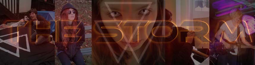
 We developed a logo that was then used in our music video as the background to our performance and in the UV on our lead singer's chest, on the website multiple times and the front of the album cover. The consistent use of the logo provides a visual motif recognised as a representation of our band.


Half way through post-production, we decided to collaborate with 'Influx', another group's artist creation of a similar genre. We produced this poster.
Promoting both our bands simultaneously, we felt that this symbiotic relationship was mutually beneficial and was a great example of a marketing plan used in the real music industry to further an artist's career and build an artist identity.
 We developed a colour scheme of acid blue, white and black that ran consistently through our website and album cover. We also managed to incorporate it into our video during colour grading of the narrative where we added a blue tint to highlight the supernatural elements of the video but more relevantly to provide a consistency throughout our marketing and image development.
 Our website is the heart of our entire project. We have both our album cover spread and music video on it, enabling our fans to access everything they need in one easy to use, efficient place.
Question 1: In what ways does your media product use, develop or challenge forms and conventions of real media products?
The media product I have created is an underground, drum and bass, electro-rock band called The Storm including their debut video, album cover and website. To be able to construct a successful and consistent brand image we had to be aware of the conventions of our chosen genre in order to chose whether or not we would use, challenge or develop upon them.
Developing and Challenging Conventions of Real Media Products:

 I feel that our album cover conforms to the conventions of drum and bass. As you can see by these examples, our logo is similar to many existing drum and bass logos, using an already established and identifiable modernistic style of font to appeal to fans of the genre, allowing them to recognise our band's genre without having to listen to the music. Hopefully this would create an interest for them, inciting them to check out the music. Our inside sleeves have pictures of each band member, with our lead singer taking up a whole cover. It is common to find the lead singer presented as a front man for the band, so we adhered to this convention, giving Eoin's picture more space. The track listing contains songs that we felt were reflective of our band's image. Natural, intense and enigmatic is exactly what we were trying to present.

 When designing our website, we aimed to focus strongly on the news updates of upcoming gigs. As drum and bass is a social genre of music, we felt it was important to present the opportunity to enjoy the music live as much as possible. This also adheres to our target market's needs and gratifications; a regular gig-goer, social, enjoys a good night out. As you can see from Nero's website, they have followed the same idea, strongly focusing on tour dates and upcoming gigs. Following conventions as we did for our video, we stuck to the presentation of live dates on our home page, just as Nero has done. As you can see, we also used the blue and black colour scheme shown in our other ancillary task, the album cover.
Utilising Conventions of Real Media Products:
Developing and Challenging Conventions of Real Media Products:
Using Barthes Enigma Code
The main enigma throughout the video is present in the narrative. The whole narrative story is open to a certain amount of interpretation; we never specify the exact reason that the girl is stalking the boy, nor the reality of her character. As you can see, audience feedback gave mixed responses, but all adhered to our original idea of a boy battling with his past demons and then coming to grips with them and finding peace, symbolised by the switch in power then the kiss and fading of the girl at the end.

Album Cover

Other conventions of album covers that we followed are:
The inclusion of a barcode, institutional information: record label logo/reference, copyright.
We decided to create our own record label, owned by Warner Bros, and named ourselves 'Pulse Records'. The logo was simple to make and looks professional.
The Website
 When designing our website, we aimed to focus strongly on the news updates of upcoming gigs. As drum and bass is a social genre of music, we felt it was important to present the opportunity to enjoy the music live as much as possible. This also adheres to our target market's needs and gratifications; a regular gig-goer, social, enjoys a good night out. As you can see from Nero's website, they have followed the same idea, strongly focusing on tour dates and upcoming gigs. Following conventions as we did for our video, we stuck to the presentation of live dates on our home page, just as Nero has done. As you can see, we also used the blue and black colour scheme shown in our other ancillary task, the album cover.
Our Website:
Friday 9 December 2011
Screening of Final Video
Today we screened all of the department's music videos, and over 100 people turned up! I couldn't stop shaking and loads of people came up to our group afterwards to give amazingly positive feedback! Extremely exciting, and also suggestive of the success of our video.
 |
| The Facebook event to our screening |
Subscribe to:
Posts (Atom)